No Results Found
The page you requested could not be found. Try refining your search, or use the navigation above to locate the post.
")
![]() Estimated reading time: 7 minutes
Estimated reading time: 7 minutes
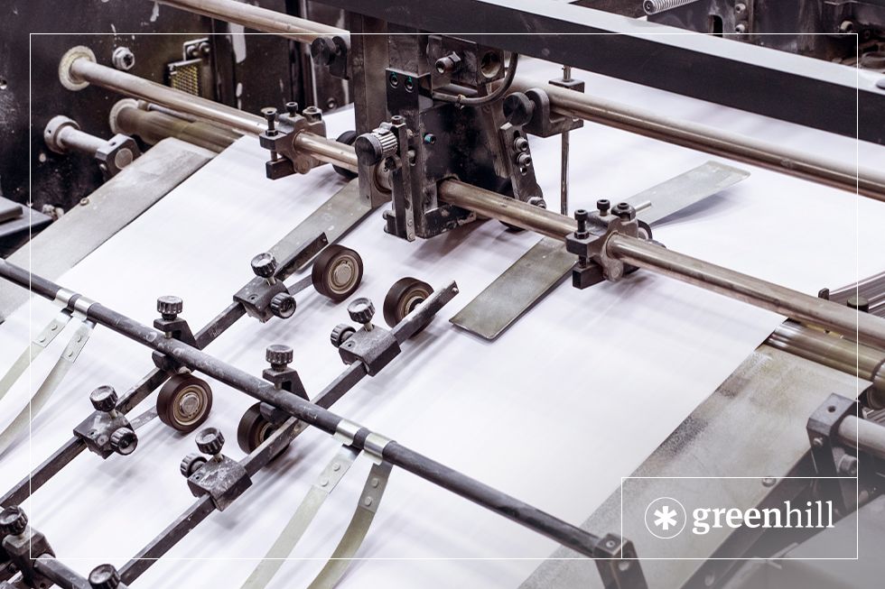
When considering the print of your book, it’s good to know the difference between the paper types available for book printing. This blog will give you a basic guide to the different kinds of paper and treatments available for the paper you can use in your book.
There are three main types of paper that you can use to print your book on: white paper, cream paper, and book-cream/groundwood paper. Each are useful for different purposes in printing:
White paper:
Cream paper:
Book-cream / Groundwood paper:


GSM (Grams per Square Metre), is used to indicate the thickness of materials such as paper.
|
35 – 55 GSM |
The thinnest of the more commonly used paper types. Usually used for newspapers. |
|
70 – 90 GSM |
A thin paper. Usually used in notebooks and novels. |
|
90 – 100 GSM |
The most common paper weight. Used in recreational printers found in offices and homes. |
|
120 – 150 GSM |
This paper is most often used for thin flyers, takeaway menus, and movie posters. |
|
200 – 300 GSM |
This weight is sturdier than the previous stocks but will still bend. Used often for magazine covers and higher-quality flyers and menus. |
|
350 – 450 GSM |
Thick, card-like stock, more difficult to bend. Used for a few different products including greeting cards, business cards, and postcards. |
Paper can go through a process of coating before it is printed on and bound in a book. As a general rule for most standard trade publications such as novels, uncoated paper is used for the interior pages while coated paper is used for the cover. However, this is not necessarily the best course of action for all publications depending on its contents and intended use.
There are pros and cons to both coated and uncoated paper, of course, and whichever you choose will depend on your personal preferences and what your project needs.
Uncoated paper is just that: uncoated. Unlike coated paper, it does not undergo the process of clay coating. It is best for the interior of text-heavy publications (trade novels, etc.) because it is lighter, and allows for great readability. It comes in two different finishes:
Paper that has been coated is most commonly used for the covers of paperback books or the interiors of books that are image-heavy (such as photography books, manuals, textbooks, etc.). This is because it allows for a level of image vibrancy and durability that uncoated paper does not. When a paper stock is coated, it means that it has had a clay coating applied during the paper making process. There are three different levels of finishes achieved by clay coating:
Environmentally friendly paper usually adds to the overall cost of printing a book. There are more ways to produce a low-impact book other than using recycled paper i.e. the print media. There are a number of printer practices that can reduce the environmental impact.
Environmentally sensitive paper for book printing refers to paper that is produced with a minimal environmental impact. This typically involves using sustainable materials and practices throughout the paper production process. Here are some key elements of environmentally sensitive paper for book printing:
By choosing environmentally sensitive paper for book printing, you can reduce your environmental impact and promote sustainable practices in the publishing industry.
Groundwood paper, also known as mechanical pulp paper, is made by mechanically grinding wood into pulp. It is often used for newspapers, magazines, and other publications where a lower quality paper is acceptable. While groundwood paper can be more environmentally friendly in some respects, it also has drawbacks compared to other types of paper.
In summary, groundwood paper can be more environmentally friendly in terms of energy use and carbon footprint, but it is not as high quality or durable as other types of paper. It is important to consider the specific use case and environmental priorities when choosing paper for printing.
The page you requested could not be found. Try refining your search, or use the navigation above to locate the post.
The page you requested could not be found. Try refining your search, or use the navigation above to locate the post.
In just a quick 8,000 words, this little book will equip you with the knowledge you need to successfully publish your book.
The Little Book of Big Publishing tips goes into the essentials of self-publishing a book, outlining the business and financial side of publishing, legal issues, design, editing, sales and marketing. There's even a section on how to identify a vanity-publishing scam.


![]() Estimated reading time: 6 minutes
Estimated reading time: 6 minutes
As a self-published author, book cover designs can be daunting, and there are a lot of factors to consider before committing to your final concept and design. When starting to design a book cover, you need to think about:
But how can you ensure that your book cover has everything that it needs to succeed? What do you need to focus on for your book to attract readers and distributors in a world of traditionally published books? Firstly, we recommend hiring a book cover designer and following the 5 key points discussed below to make sure that you are getting the most from your book cover and your book designer.
If nothing else, the most important thing you can do to make your book cover a success is to listen to your designer. They will make your book cover look the best it can. Your designer wants the best for your book as much as you do, and will no doubt have amazing book cover ideas that you hadn’t considered before. They are also experience professionals who have worked on a number of books in the past, so they understand the book market and know what is more likely to sell and what is more likely to not.
It is important to communicate your preferences and vision for the book in a way that can be well understood when you have the design brief with the designer. Your book designer will take cues from your brief and design a book cover that is marketable to help your book shine on the shelves and meet your expectations.
It’s important to intrigue potential readers and leave them wanting more—not leave them confused and overwhelmed. The cover should be a teaser that makes the readers want to know more and entice them to pick up your book and take it home with them. It is not necessary to try to tell the whole story of a book on its cover as it is simply a visual representation of the book meant to grab attention. If you try to include every detail that’s in your book on your cover, it will be a cluttered mess of references that are lost on potential readers.
A good cover should be visually appealing, give a sense of what genre or style the book belongs to, and accurately represent the book. Pick one to three things that best convey what your story is about and your designer will use what they can to bring your cover to life.
When thinking about book cover design, it is important to keep the target audience in mind, rather than designing solely on your own preferences. As discussed earlier, the cover should be visually appealing and reflective of the content and genre of the book, but also designed to appeal directly to the specific audience who are most likely to read it. This may involve considering factors such as age, gender, interests, and reading habits of the target audience.
Let the book designer create the cover from the eyes of a buyer. Often what an author believes they must have on their book cover doesn’t translate well to readers and they miss what the author wanted to achieve.
Though you may read a lot in the genre you wrote your book in, remember: you are the author, not your audience.
When designing a book cover, it is important to consider the genre of the book and design a cover that fits within the conventions of that genre. The buyer—whether a distributor or a reader—should be able to immediately recognise the genre of the book by the cover design. For example, a mystery novel may feature a dark and dramatic cover with a silhouette or crime scene, while a romance novel may feature a romantic image of a couple. A science fiction book cover may feature images of futuristic technology, space, or aliens. A fantasy book cover may feature images of dragons, wizards, or other mythical creatures.
This doesn’t mean that your book should be a carbon copy of another, but if the genre is not clear then the buyer will have to work harder to decipher what your book is and will be more likely to disregard it in favour for another. Gather some inspiration from within your genre and similar and pick them apart. Try to figure out which elements on those covers would work for your book and tell your designer. This will give your book designer a good starting point for your cover and let them know what you like.
When considering your book cover design, be careful not to focus on particulars, such as the exact shade of a colour, the precise positioning of an image, and the perfect font size/weight to use. While attention to detail is important in many aspects of book cover design, it is also important to keep the big picture in mind. If you give your designer a list of overly detailed instructions of what the cover must include, you’ll restrict their creative license and may end up with an unattractive book cover that just does not work.
Think about what is necessary for your book cover and what will make it attractive and successful in retail, but more importantly what is not. The goal is to create a cover that is visually appealing and accurately represents the book, rather than focusing on small details that may not have a significant impact on the overall design.
Overall, a successfully designed book cover is one that looks professional and like it belongs in the market, effectively and concisely communicates the book’s content and style, appeals to the intended audience, is visually appealing and on-par with other books in its genre, and is harmonious.
To see some of our favourite covers, check out our Instagram.
The page you requested could not be found. Try refining your search, or use the navigation above to locate the post.
The page you requested could not be found. Try refining your search, or use the navigation above to locate the post.
In just a quick 8,000 words, this little book will equip you with the knowledge you need to successfully publish your book.
The Little Book of Big Publishing tips goes into the essentials of self-publishing a book, outlining the business and financial side of publishing, legal issues, design, editing, sales and marketing. There's even a section on how to identify a vanity-publishing scam.


This book cover uses metaphor
A metaphor can be described as: a figure of speech that describes an object or action in a way that isn’t literally true, but helps explain an idea or make a comparison. https://www.grammarly.com/blog/metaphor/
‘Heart of stone’ and ‘heart of gold’ are two common ones. These present images that convey quite complex abstract concepts. Instead of saying ‘he is a very good person with good motives’ we say he has a ‘heart of gold’. The first is long-winded, ‘heart of gold’ is interesting and colourful.

A boring cover image for a boring book
Its not just about words – metaphors are a good cover design technique.
Some of the best book cover designs we have accomplished use metaphor. This avoids the book publisher’s curse – trying to convince authors not adopt a book cover with literal imagery. One author wanted this image on their book called The Fisherman – this was a literal title. Guess what the book was about? It was about a fisherman. The fisherman went to the river and fished for fish. The cover (according to the author ) needed to have a picture of a man fishing i.e. a fisherman. The result – boring, boring, boring!
When we conduct a creative brief where you the author and we, the book designer discuss how the cover design will play out – it will pay for you to think about the designer using metaphor.
Here’s a little more from Grammarly:
The page you requested could not be found. Try refining your search, or use the navigation above to locate the post.
In just a quick 8,000 words, this little book will equip you with the knowledge you need to successfully publish your book.
The Little Book of Big Publishing tips goes into the essentials of self-publishing a book, outlining the business and financial side of publishing, legal issues, design, editing, sales and marketing. There's even a section on how to identify a vanity-publishing scam.