No Results Found
The page you requested could not be found. Try refining your search, or use the navigation above to locate the post.


‘I want my book design to be unique. Something no one has ever seen before. This will sell my book.’
This is a common statement we hear from authors—especially those releasing their first book. You’ve poured your heart into your manuscript, and you want the outside to reflect how special it is. You want it to stand out, to be different and to “wow” people. But the truth is that a truly unique cover isn’t always what sells a book, in fact it can have an opposite effect. Most bestselling books within a genre follow a visual trend—and there’s a good reason why.
Readers are drawn to what they recognise. They make fast decisions based on visual cues. When they scan a bookstore shelf or scroll through online listings, they’re looking for signals:
And they rely on the cover to answer that question for them.
If your cover doesn’t speak the language of your genre, it risks being overlooked completely.
Most bestselling books follow visual trends within their genre. Not because they lack creativity, but because they know how to play to the expectations of their target audience.
Let’s unpack why cover clichés aren’t something to fear and how embracing them can actually be the smartest move you make for your book.
![]() Estimated reading time: 6 minutes
Estimated reading time: 6 minutes
Take a look at Emily Henry. When she burst onto the scene, her covers were bold, colourful, and “romantic” in a fresh, modern way: flat, vibrant colour palettes, illustrated figures, playful, clean design. They spoke to the genre.
Suddenly, the shelves were packed with similar designs, and that wasn’t by accident. Her covers worked and they connected with readers. They signalled exactly what kind of story was inside: light-hearted, heartfelt, contemporary romance with emotional depth. Readers responded in droves—and other publishers took note. That’s how book design trends start.
Just like in the fashion world, book cover trends emerge when a particular look resonates. When it feels timely and captures the current cultural mood. A few titles catch fire, the aesthetic spreads, and soon it becomes the visual shorthand for that genre or tone.
It’s not about copying—it’s about communicating. Covers that follow genre trends aren’t lazy or unoriginal; they’re strategic. These cover designers are using design language that readers already understand.
Think of it this way: if your book is a romantic comedy, but your cover looks like a thriller, you’re sending mixed signals. A reader might skip right past it—not because they won’t like your story, but because your cover told them it wasn’t for them.
Trends work because they help your ideal reader instantly identify that your book is the kind of book they’re looking for. So instead of asking ‘How do I make my cover unlike anything else?’ try asking, ‘How do I make sure my cover speaks clearly to my reader?’
That’s the real key.
The word “cliché” often gets a bad rap, but in the world of book design, clichés exist for a reason.
These familiar visual elements don’t just appear out of thin air. They became common because they consistently help connect the right readers with the right books. In a highly saturated market where readers are bombarded with options, clarity and instant recognition are powerful tools.
Here’s why using well-worn design elements can actually drive more interest (and more sales) for your book:
Studies show that humans process visual information in less than half a second. That’s all the time you have to make a first impression. When someone scrolls through an online bookstore or walks past a shelf, your cover needs to immediately communicate this is for you. And it needs to do so without the reader even thinking about it.
Familiar genre elements—like a silhouetted figure on a foggy street for a crime thriller, or a pastel-illustrated couple on a romantic beach for a romance—act like a visual shortcut. They let the reader know “this story is the kind you love”. No guessing, no confusion, just instant recognition and connection.
That moment of clarity makes all the difference between a scroll-past and a click-through.
We’re wired to respond emotionally to what we see. Colour theory, typography, layout, and imagery all evoke specific feelings—and savvy cover design leans into that.
Think about it:
When your cover uses visual elements that align with the genre and emotional tone of your story, you’re not just creating something attractive, you’re priming the reader’s expectations before they’ve read a single word.
This kind of alignment between genre, emotion, and design builds trust. And trust leads to purchases and loyal readers.
Some visual elements have become so closely tied to their genres that they’re instantly recognisable—and incredibly effective. These aren’t outdated or lazy design choices. They’re genre anchors—reliable cues that tell readers in a split second what kind of story they’re about to step into.
These aren’t tired clichés—they’re trusted markers, and in a sea of titles competing for attention, that kind of instant clarity is a tool. It helps readers spot the kind of book they already love, which means your book lands in the hands of someone who’s genuinely excited to read it. That’s the overall goal.
Originality isn’t about breaking the mould. It’s about adding a fresh twist within the mould. You can (and should!) aim to create a cover that feels distinct, but if your design strays too far from what readers expect, it runs the risk of being confusing or invisible.
For fiction, your cover’s job is clear: communicate genre and tone at a glance. If a potential reader needs to stop and figure out what your cover is trying to say, they’re likely to move on. People don’t browse bookstores with the intent of solving puzzles—they’re scanning for books that feel familiar, exciting, and right for them.
Originality, in this context, is about detail, not structure. Maybe it’s a unique colour palette, an unusual perspective, or a symbolic object that adds intrigue. But the overall design still needs to stay rooted in genre conventions to effectively do its job
Non-fiction is a different ball game. Readers often expect to be surprised, challenged, or intrigued. This means there’s more room for visual metaphor and unexpected juxtapositions.
These covers don’t need to scream a specific emotion—they need to spark curiosity. In non-fiction, the cover can function almost like a hook or question: ‘What is this about? Why does this image feel strange? I need to know more.’ That kind of intrigue works because the reader comes in prepared to be educated or provoked.
Being original doesn’t mean being obscure. It means being smart and adding just enough personality to a proven formula. When you respect the language of your genre while finding a subtle way to express your unique voice, that’s where great cover design lives.
Let’s clear something up: all publishers use stock photography.
From Big Five publishing houses to indie imprints and everything in between, stock imagery is an industry-standard tool in the cover designer’s toolkit. If you look at the copyright page or back cover of some of the books on your shelves, chances are it will say stock photography has been used.
It’s a smart, efficient, and professional way to create compelling, high-quality book covers.
Stock images aren’t used because of laziness or lack of originality. They’re used because they provide access to a vast, high-resolution library of professionally lit, styled, and edited visuals. These images become starting points that allow designers to focus on crafting something polished and impactful without the limitations of budget-heavy photo shoots.
Cover designers use stock to streamline the process and focus on composition, storytelling, and style. When you work with a professional designer, they’re not just pasting a stock image onto your cover and calling it done. They’re manipulating it, blending multiple images, adjusting colour palettes, cropping, layering textures, adding lighting effects, typography, overlays, and illustration work.
And what is the end product? A cover that looks custom-built and is aligned with your genre, your tone, and your target reader.
In many cases, the original source image is unrecognisable by the time the final cover is complete. That’s the magic of thoughtful design: it turns something ordinary into something emotionally resonant and uniquely yours.
It’s a fair concern, but the likelihood of another book using the exact same image, in the exact same way, is low. What truly sets your cover apart isn’t just the photo, it’s how it’s used. The typography, layout, colour grading, and overall aesthetic come together to make your version distinct.
If you’re working with a skilled designer, they’ll most likely avoid overused stock or generic imagery that risks blending too far into the crowd.
Stock photography isn’t a compromise. It allows designers to deliver creative, beautiful, and market-ready covers at a fraction of the cost and time required for custom photoshoots or illustrations.
So, if you’re worried your cover won’t be “original enough” because it uses stock—don’t be.
In the end, great book cover design isn’t about reinventing the wheel—it’s about understanding the expectations of your readers and using familiar design elements to your advantage.
By embracing genre conventions and leaning into trends, you ensure your cover resonates with your audience and stands out in a crowded market.
Originality isn’t about being obscure; it’s about finding the perfect balance between clarity and creativity. When you respect the visual language of your genre while adding your unique touch, you’ll create a cover that not only grabs attention but also draws readers in, eager to discover the story inside.
The page you requested could not be found. Try refining your search, or use the navigation above to locate the post.
The page you requested could not be found. Try refining your search, or use the navigation above to locate the post.
In just a quick 8,000 words, this little book will equip you with the knowledge you need to successfully publish your book.
The Little Book of Big Publishing tips goes into the essentials of self-publishing a book, outlining the business and financial side of publishing, legal issues, design, editing, sales and marketing. There's even a section on how to identify a vanity-publishing scam.

![]() Estimated reading time: 5 minutes
Estimated reading time: 5 minutes
Your writing is perfect. The world needs to hear your voice. You have a unique style that is new and fresh. You’ve written a book—why should you let anyone diminish your tone?
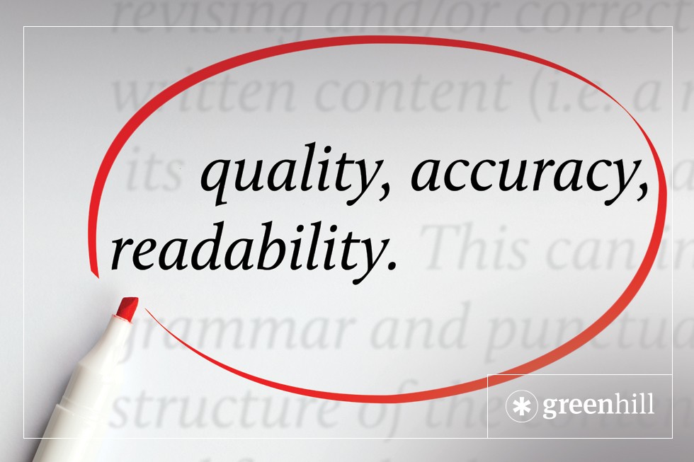
Let’s talk about editing.
To talk about editing, you first need to realise that you’re not special. I’ll repeat that: you’re not special. People have been writing for thousands of years. You’re not new. The world will continue if you write or don’t write.
That is not meant as a downer. Writing something that someone wants to read is a noble pursuit. There is nothing more rewarding as a writer than when someone tells you they enjoyed your book. However, this is about editing, so buckle up.
For a start, editors don’t write the book, you do. The essence of every book contains every author’s own style. Whether you are writing a novel, a children’s book or a family biography, they all contain the author’s particular style. However, they all need editing.
There are several types of editors. A lot of them have different names which all mean the same thing. The first person you need is the structural editor. This is the person who will read your manuscript and tell you if you are making sense. The next, a copy editor who highlights all your mid-picture inconsistencies and wrongdoings. The last one is the proofreader who makes sure the full stops and commas are in the right place.
The common misgiving is that a new writer thinks they don’t need to be edited because they have got everything right. That first draft is perfection, right? Wrong.
The other misgiving is that an editor will change their voice somehow. Also wrong. This is not what an editor does.
Consider this: does Stephen King have a particular style? Does John Grisham have a particular style? Does Jane Harper have a particular style? Obviously, the answer is yes. And yet all of these great writers have editors. Go figure.
The reason is, when we write a first draft we’re putting words on the page (hopefully in a coherent way). The prose is often flabby and sometimes rambling. This is fine and perfectly normal. However, it needs to be edited.
So, as a writer you need to swallow your ego and get over yourself. Realise that you are not God’s gift to writing and find an editor that can and should be brutal on your work. A machete needs to be taken to every first draft. Sentences need to be tight and easily readable.
If you think your work does not require editing, then you are badly mistaken. Editing does not change your style or reduce your voice. On the contrary, it will actually enhance it. Find the right editor who ‘gets’ your work and let them work their magic.
As an example, I was given a self-help book by my sister-in-law that was written by a friend of hers. I read the first ten pages and said that the book had not been edited. My sister-in-law laughed and said that of course it hadn’t been because her voice was “not to be altered” apparently. The thing is, by reading those ten pages I could tell that it had not been edited because it read that way. There was no cadence to the sentences. There was no flow to how it read. It was hard work. I gave up after the ten pages because it was simply too hard. Every sentence jarred because it hadn’t been edited. It wasn’t tight. It wasn’t easy to read.
This is not meant to be a criticism. Anyone who takes the time and has the skill to write anything should be applauded and even nurtured. However, if you think you don’t need your work edited then you are living in a fool’s paradise. Keep writing.
The page you requested could not be found. Try refining your search, or use the navigation above to locate the post.
The page you requested could not be found. Try refining your search, or use the navigation above to locate the post.
In just a quick 8,000 words, this little book will equip you with the knowledge you need to successfully publish your book.
The Little Book of Big Publishing tips goes into the essentials of self-publishing a book, outlining the business and financial side of publishing, legal issues, design, editing, sales and marketing. There's even a section on how to identify a vanity-publishing scam.

Book covers are a very important part of book design and book marketing. So I understand why book cover design can be a element of focus (and sometimes angst) for independent authors. Often authors overthink their covers, putting too much emphasis on the interpretive meaning. They want their covers to do the impossible – convey everything about their book, extending even to subplots and the book’s nuances. The problem is that readers (or book buyers) simply won’t understand the cover. These covers can end up looking really poor.
We often have authors who provide a sometimes detailed cover brief asking for the cover to convey meaning. Also common is the request to make the cover suitable for readers, the author’s reader target audience.
Authors ask:
Often this sort of brief is because the author is overthinking everything. Or the author doesn’t understand that cover design is largely about ‘art’ and not ‘science’. Authors may want the cover to do the impossible.
This is often overly ambitious. Authors can give several parameters that the cover design needs to achieve and often this is an impossible task for a book cover design. A book of 70,000 words is so long because the author needs to build a complex argument – to convey their thesis or ideas to the reader. It’s words, words and more words. There might be one big idea and a dozen supporting ideas. With this approach to design briefing the result is a book cover design that might look a little like a pizza, a smashing together of images that try to convey meaning (or reflect the book’s many elements). Aesthetically the cover design might be poor or unpleasant to view. Readers usually have great difficulty de-coding or understanding what the cover is about. In a marketing sense this is the worst possible outcome. The cover looks bad and the reader finds it confusing.
This is a big ask. Having read a ‘marketing 101’ business book that outlined the concept of ‘targeting’, one author said I want the book to appeal to women aged 35-45 years, medical professionals, who are thought leaders. But also make it desirable for men and the general public of all readers. This might be possible (the first parameter) with some market research and psychographic profiling. But its near impossible. Even if research was done the book designer would have to apply those findings in a graphic sense. For example 35% of one target group may ‘have high concern about global warming’, ‘32% may ‘not fear global warming’. The data is inconclusive. One author briefed can you make it just a little bit ‘environmental’. It’s the sort of thing that isn’t actionable by a book designer.
One author told our book designer that the cover couldn’t be green because that colour does not appeal to women aged 65+. Another said the cover font can’t be in all capitals rather in upper and lower case, because it appears ‘too blocky’ or ‘regimented’ and the young men under 25 years he is targeting are freethinkers. These examples are bizarre but true!
When point 1 and point 2 combine there’s trouble brewing. And it can get even worse, much worse (see Section 3 below).
Often the best book cover designs are too ambitious purely because of the author’s desire to convey complexity of meaning. An ugly cover can be the result, and the vast majority of readers simply won’t purchase or even pick up an ugly book.
The book designer has aesthetics top of mind, and these can often be in conflict with the author’s personal preferences. The best book cover designs are when the book designer is granted creative license.
Book cover artwork can be purely decorative. This can mean using a pattern or texture or simply colour. Decoration as an aesthetic art form was pioneered by master artists like Henri Matisse and Piet Mondrian and of course is an enduring feature of Islamic art. And patterns are so pleasing to the human eye – its why wallpaper is so popular!
(Point 1 + Point 2) x (author’s aesthetic preferences) = a very bad book cover.
There’s a third part of the ‘formula’. That is the author’s aesthetic preference or preconceptions.
A really fine author with a non-fiction self-help guide stumbled at the last hurdle of book cover design. The book cover was orange. He remarked ‘we can’t have that because of Donald Trump… the book won’t sell with an orange cover”. Why? ‘Because Donald Trump is called “Orange Man” ‘. To demonstrate the folly of this thinking I said ‘the orange growing industry in California must be in real trouble’… he got my point.
Another author didn’t want ‘white space’ on the cover because it ‘says to the reader I don’t have much to say’. Another said ‘I don’t like the colour blue’, another said ‘no primary colours, I don’t like bright colours’. The trouble with this sort of instruction to a book designer is that the author is designing the book cover for themselves, not for the market. And it ‘cramps’ the book designer’s greatest power – the ability to craft a great book design with nuanced creative decision making.
If the answer is ‘yes’, what then? You don’t need to have a cover tell the whole story. You don’t need a book cover to have meaning. A powerful alternative is to have the cover artwork set the ‘mood’ or ‘tone’.
Often with non-fiction books, a good design approach is to use text/typography, colour, shape and pattern.
Nothing beats a great title… Ken Blanchard’s ‘One Minute Manager’ is an awesome title that injects meaning. But then the title combined with shape and colour makes for a very effective book cover design. It’s simple and has a great aesthetic. The title assumes the dominant role of conveying meaning.

Using type and patterns is a very effective way to produce a ‘meaningless’ cover that can have a great aesthetic. Remember a great aesthetic can be more than half of the battle in producing a marketable book. If the book is aesthetically pleasing it means most people will find it ‘likeable’ and a likeable book is a desirable book.

Patterns are great at setting tone or mood. A pattern can be sophisticated or rough. A pattern can be subtle or bold. A pattern can be exciting or sober. And, yes at risk of appearing contradictory, a pattern can convey meaning (just to insert a little more complexity into this blog post!)

The page you requested could not be found. Try refining your search, or use the navigation above to locate the post.
The page you requested could not be found. Try refining your search, or use the navigation above to locate the post.
In just a quick 8,000 words, this little book will equip you with the knowledge you need to successfully publish your book.
The Little Book of Big Publishing tips goes into the essentials of self-publishing a book, outlining the business and financial side of publishing, legal issues, design, editing, sales and marketing. There's even a section on how to identify a vanity-publishing scam.